
Find a component
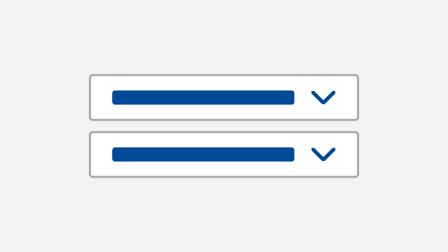
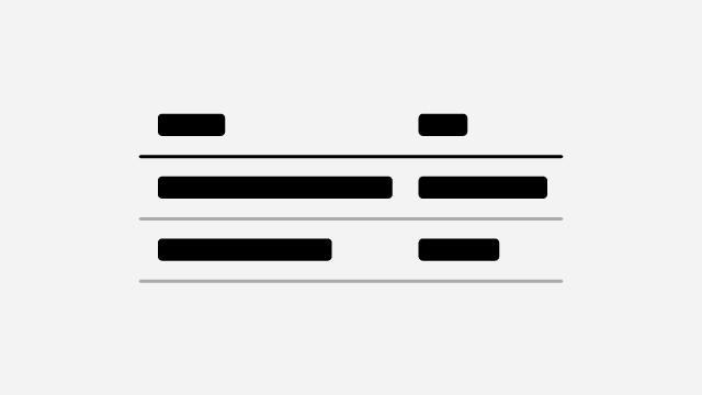
Accordions
Accordions allow you to create expandable and collapsible pieces of content.
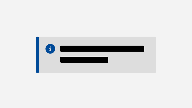
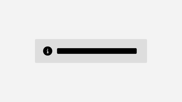
Alerts
Alerts draw attention to important messaging or provide contextual feedback.
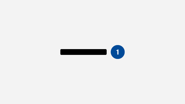
Badges
Badges indicate status, item count, or draw attention to another interface element.
Blockquote
Blockquotes are used to quote external sources or highlight an important excerpt.
Breadcrumbs
Breadcrumbs help users understand where they are within the information architecture.

Buttons
Buttons help users perform actions like saving their information, submitting an application and more.
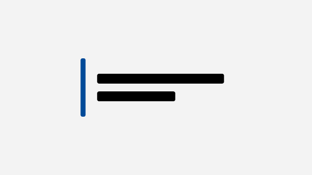
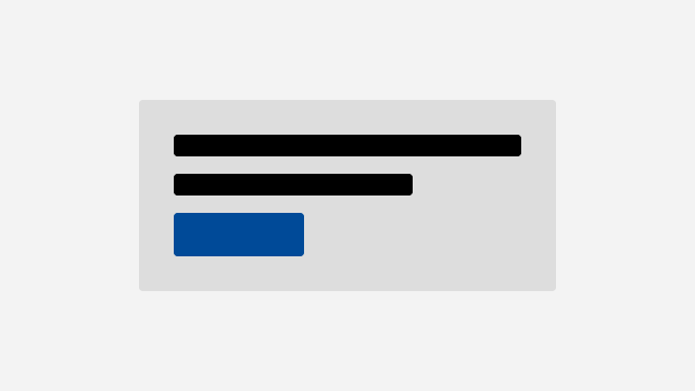
Callouts
Callouts highlight important information, excerpts or examples within a page.
Calls to action
Calls to action encourage users to take specific actions.
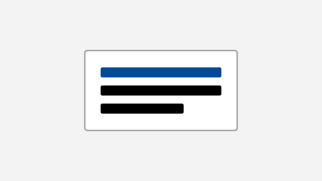
Cards
Cards help users navigate and find information by presenting scannable topics and summaries.

Content blocks
Content blocks create information groups that are scannable and can offer multiple actions.
Content lists
Content lists are used to display search results or links to other resources.
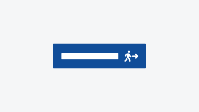
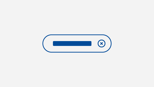
Exit button
Provide a quick exit option for pages discussing sensitive topics to support vulnerable users.
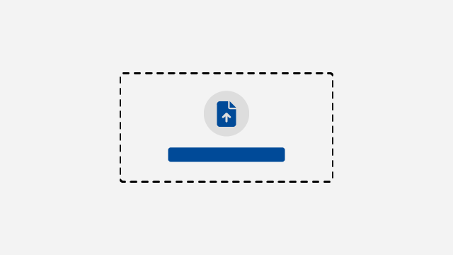
File uploads
File uploads allow users to upload documents and images.
Footers
Footers are secondary navigation that contain copyright, privacy and other legal information.
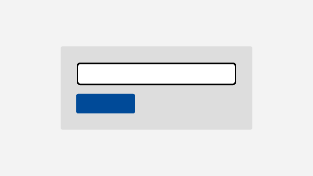
Forms
Forms allow users to provide information, select options and complete transactions.

Hero banners
Hero banners introduce the information or service with a title and brief description.

Images and figures
Images and figures provide various options for responsive display and formatting.

Links
Link to other pages, files, websites, or anchors within the same page.
Main navigation
Main navigation is used to show the top level of your information architecture.
Mastheads
Mastheads clearly identify official Government of New Brunswick websites.
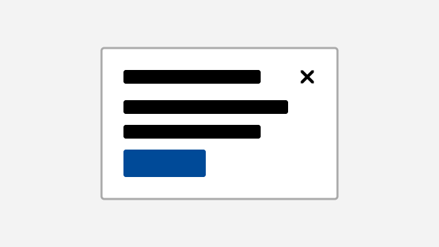
Modals
Modals can be used to focus attention on a specific task, information, or decision point.

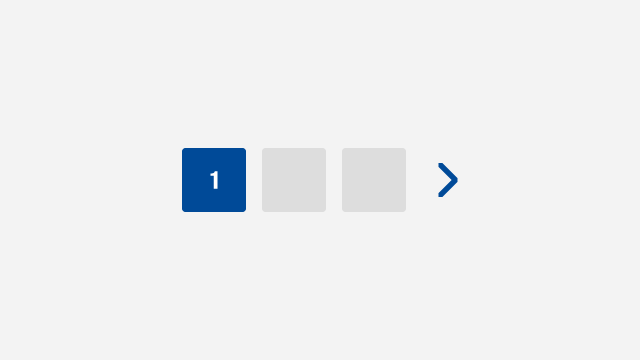
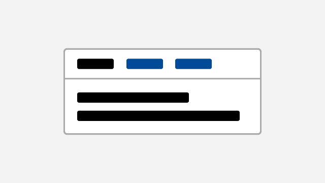
Navs
Navs enable users to move through service steps or information hierarchy.

Online service initiation
Create a call to action for starting an online service that explains other ways to access it.
Pagination
Pagination is used to break large lists of content across a series of pages.
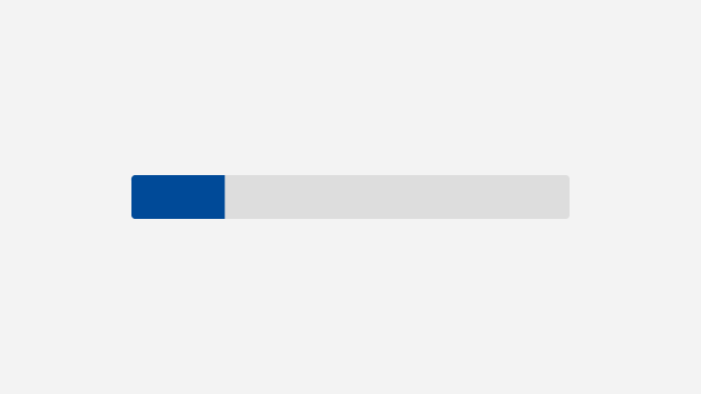
Progress bar
Progress bars provide feedback to users about the progress of a process.
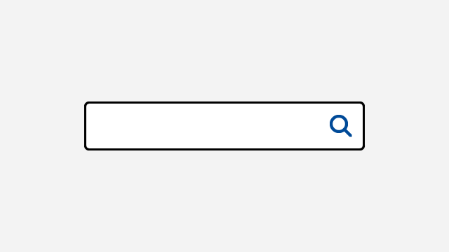
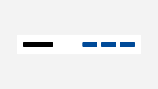
Search
Search forms help users quickly find what they are looking for.
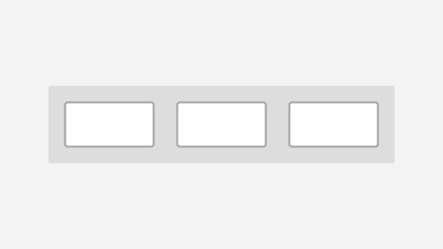
Sections
Sections group content and components and apply spacing and background styles.

Spinners
Spinners let users know when content or components are loading.
Tables
Tables present data in a structured format for users to scan and compare.
Tabs
Tabs let users navigate between related sections of content on the same page.
Tags
Tags label items with metadata so users can filter and navigate content by categories.

Tooltips
Tooltips display informative text when users hover over, focus on, or tap an element.