
Standard practices
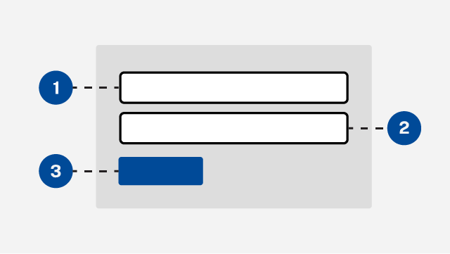
Form layouts
Structure forms so they are organized, accessible, and easy to use on all devices.
Form patterns
Follow approved patterns for collecting details such as personal and account information.
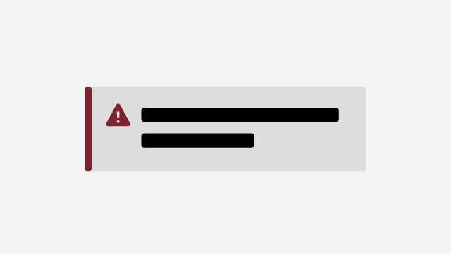
Error messages
Write error messages that are clear, actionable, and help users recover quickly.
Form inputs
Checkbox
A checkbox lets users select or unselect a single option.
Checkbox group
A checkbox group lets users to select options from a list.
Date
Ask for a date in a clear, accessible format.
How to ask users for their email address.
File upload
File uploads allow users to upload documents and images.
International phone number
How to request an international phone number
Phone number
How to ask users for their phone number.
Predictive list
How to show suggestions based on user input.
Radio buttons
How to use radio buttons to give users mutually exclusive choices.
Search
Help users quickly find what they are looking for.
Select list
Use a dropdown menu to let users select one option from a list.
Star rating
How to implement a star rating component.
Text area
How to use a text area for multiline user input.
Text input
Create a basic text input field.