
Why it matters
A well-designed form has a profound impact on the user experience.
Forms are a fundamental part of online services. How you structure and present these forms can make the difference between a frustrated user and a satisfied one.
Good form layouts:
- help users complete tasks quickly
- make it clear to users what information is being requested
- reduce errors such as submitting incorrect or incomplete information
- contribute to a seamless experience across all GNB programs and services
How to do it
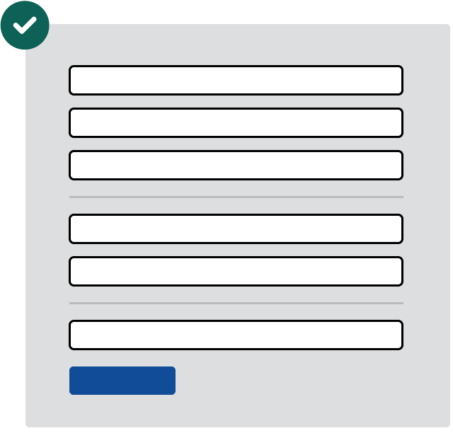
Logical groupings
Grouping related form fields helps make it clear which information is required at each step. This approach makes it easier for people to focus on smaller groups of fields rather than trying to understand the entire form at once.
An example of this in practice can be found in the screenshots of the Remote Satellite Internet Rebate Program under the Get inspired section of the GNB Design System SharePoint site.
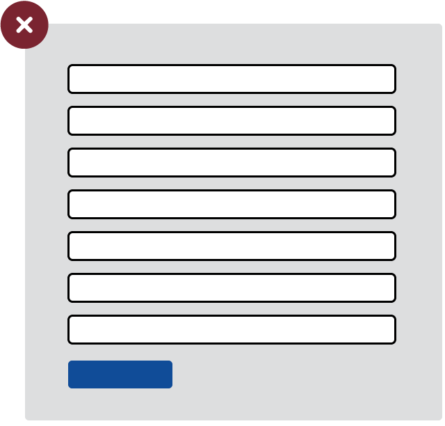
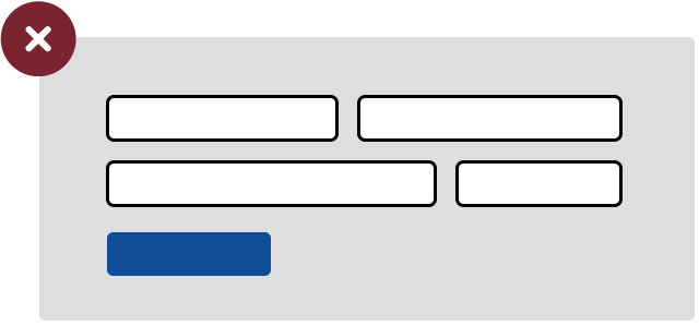
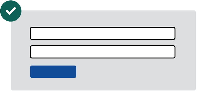
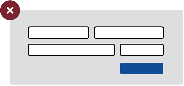
Single column
Over 50% of visitors to GNB.ca in the past year were on mobile devices. Duplicating the multi-column layouts of paper forms must be avoided to provide the best experience for users on any device.
Align to the left
Since 2006, we know that users most often read web content in an F-Shaped pattern and further research has shown that users spend 80% of their time viewing the left half of the page.
Keeping all form elements (including buttons) left aligned ensures that your users won’t overlook any part of your form and will help reduce errors.
Consider progressive disclosure for complex forms
In longer or more complex forms, consider implementing progressive disclosure approach. Either by breaking the form across more than one screen, or by only revealing one section at a time. This approach prevents overwhelming users with a lengthy list of fields all at once.